Stamped
VIP onboarding
CASE STUDY
overview
Stamped is an ecommerce platform that provides loyalty and reviews capabilities to online store. To set up a loyalty program, a merchant must fill out a set of customizable blocks for their store that explains how their rewards program functions. Customers can earn rewards based on purchases, following on social media or a variety of other activities of the merchants choosing. They can also spend their reward points in a similar fashion.
problem
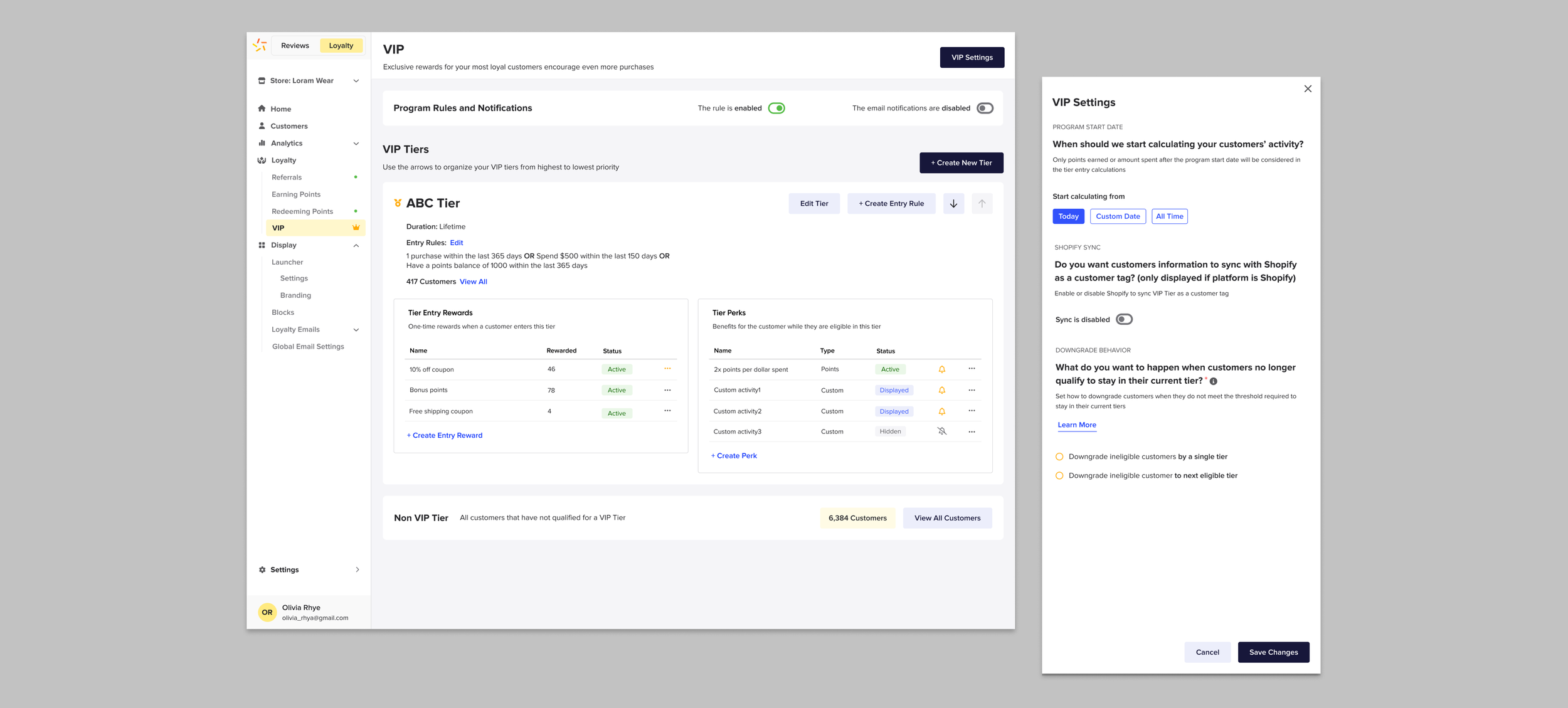
A large part of the loyalty platform is the VIP program. The majority of Stamped merchants are on paid account that include customer service help with set up. Free account holders do not have access to this and must navigate set up via Loom videos provided by our resources and online support documentation. General VIP set up involves navigating to the VIP page and setting up the program settings, tiers and entry rewards along with perk rules.
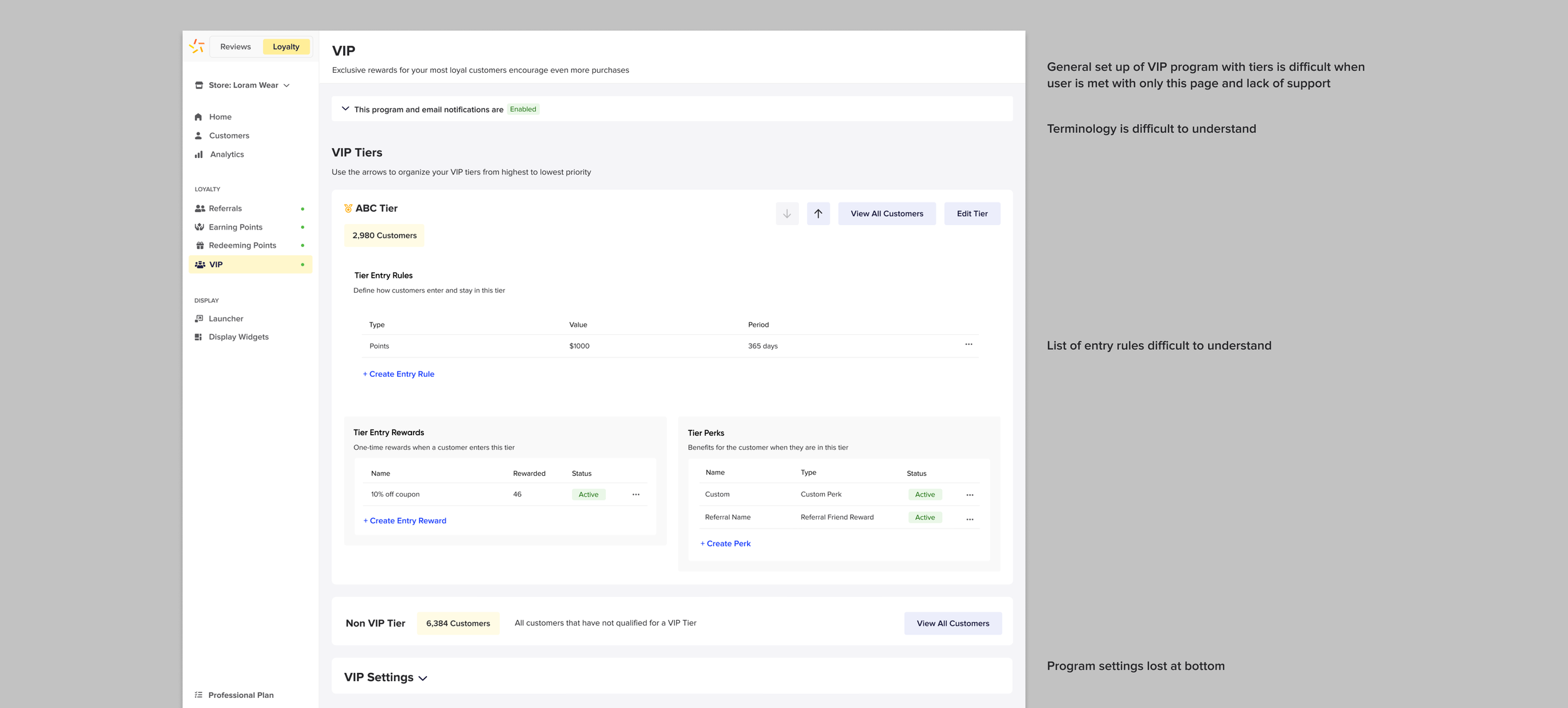
When faced with the existing VIP page, many inexperienced users are at a loss in how to understand what to set up first or how the VIP program works, let alone the meaning of the terminology. Entry rules (the terms a customer must meet in order to gain access to a certain tier) are listed on the existing page in an order that is not user friendly to understand. Also the core program settings were placed at the bottom of the page which are easy to miss.
existing screen
solution
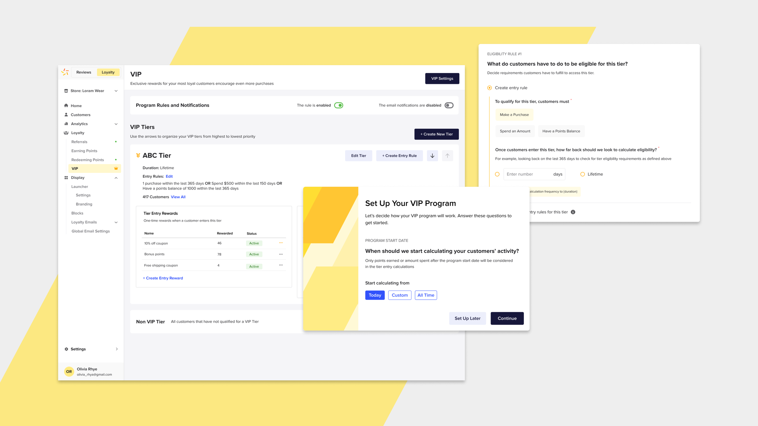
The project to reassess how VIP programs were set up took about 2 months and involved myself, the product director and the design lead. I was responsible for working with my design lead in identifying areas of improvement in the VIP page and set up process and later creating high fidelity wireframes.
After identifying there needed to be improvements to the actual VIP page, there was discussion with the product director. It was decided to build in onboarding when the page was launched for the first time. The onboarding flow involved launching a colourful branded modal to cover the main program set up so that these would not be missed. After, the flow proceeded to a page by page style onboarding that broke down the steps of creating a tier within the program and then creating entry rewards. The user had the option of skipping steps of the onboarding and completing them later.
I introduced a new component to the design guide that would reference previous data the user had entered. This reference point is a helpful information tip reminding the user what a term may mean, relative to a selection they may have chosen. The UI of the question cards are expandable for the entry rewards once the user chooses to create one, so they are not inundated with too much information on a screen. Set up language was phrased in question form so the user could easily understand each step. We coordinated with the marketing team for copywriting.
After the user had completed the onboarding flow, they were sent to the final VIP page, at which point they could go back and set up any entry rules and settings they skipped the first time. The redesign of this page involved moving the VIP settings to the top, as a button that would open a side drawer. The tier card also was redesigned with a sentence structure summary of the entry rules for comprehension.
WIREFRAMES