Reef Townhomes
branding & print
branding
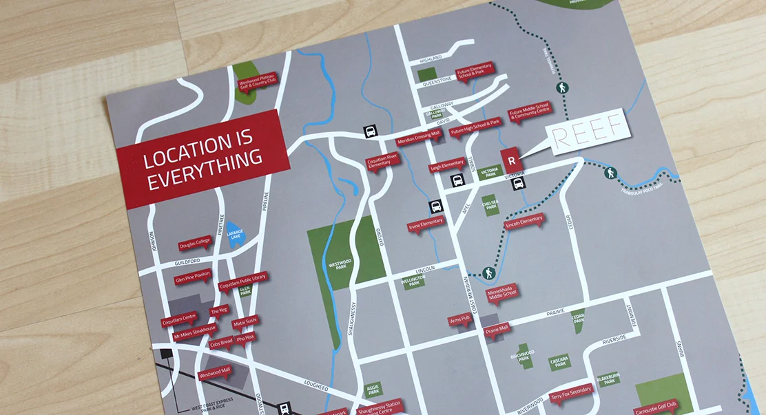
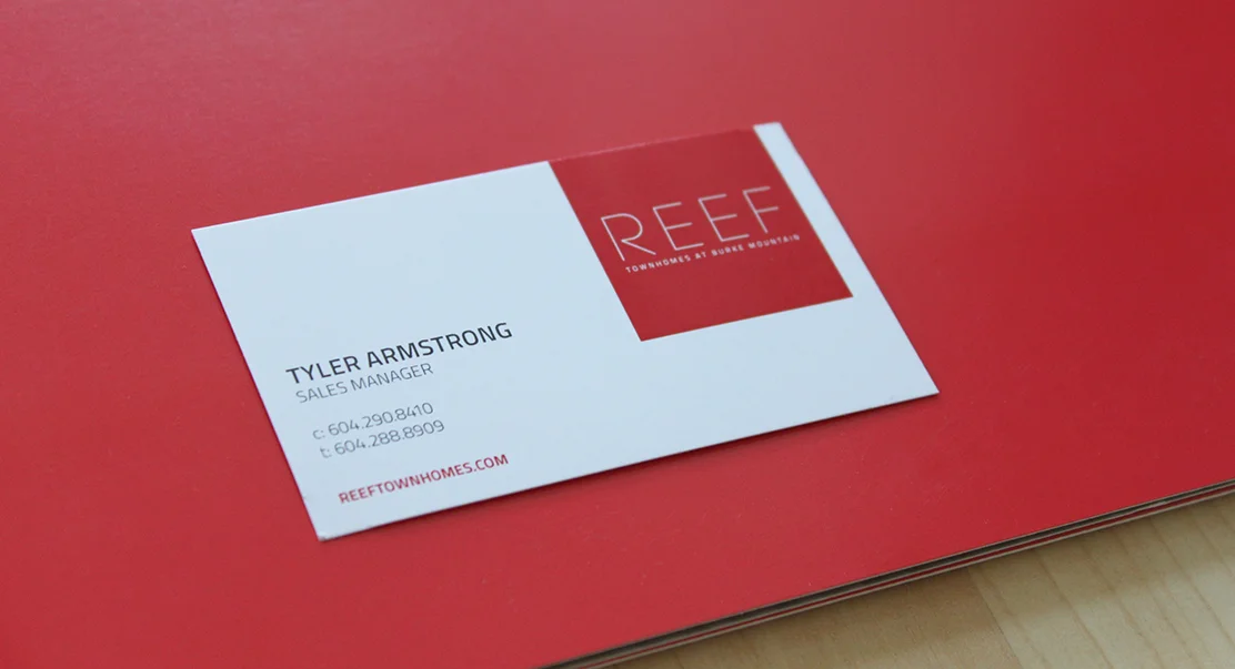
Alpha Beta’s townhome development in Coquitlam needed an identity and materials aimed at young families. The simple wordmark is meant to speak to the simplicity of modern day living. The geometric typeface reflects the modular layout of the suites. Reef is meant to evoke the emotions and feelings of being at the seaside. Red rather than blues were the colours chosen due to its vibrance and warmth.
The bold red and square shaped brochure was born to draw attention to its young audience, while maintaining a sophisticated feel.